The Art of Neutral Color Palettes in Home Staging
7 November 2025
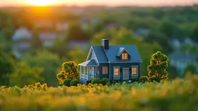
When it comes to selling a home, first impressions are everything. The way a space looks and feels can either make buyers fall in love at first sight or send them running for the hills. This is where home staging comes into play, and one of the most effective tools in a stager's arsenal is neutral color palettes.
But wait—does “neutral” mean boring? Absolutely not! Neutral colors create a blank canvas that allows potential buyers to envision themselves in the space, making it a powerful psychological tool in real estate. So, let’s dive deep into the art of neutral color palettes in home staging and how they can turn a house into a buyer’s dream home. 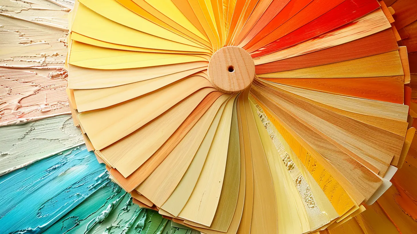
Why Neutral Colors Win in Home Staging
Neutral colors are the unsung heroes of home staging, and for good reason. They provide a clean, fresh, and inviting atmosphere that appeals to the widest range of buyers.Here’s why neutral tones work like a charm:
1. Makes Spaces Feel Bigger and Brighter
Dark, bold colors can make a room feel smaller and more enclosed. On the flip side, neutral shades—especially light tones—reflect natural light, giving the illusion of a larger, airier space. Whether it’s a compact condo or a spacious suburban house, neutrals can magically expand a room without knocking down any walls.2. Universally Appealing
Not everyone loves a deep purple accent wall or bright yellow kitchen cabinets. (Shocking, right?) Neutral tones ensure that your home appeals to the widest possible audience, making it easier for buyers to see themselves living there.3. Creates a Cohesive Look
One well-kept secret in staging is the use of a unified, flowing color palette. When all the rooms in a house share a similar neutral base, the space feels tied together, creating a seamless and cohesive experience that buyers love.4. Acts as a Blank Slate
Buyers have their own unique taste and style, which means bold design choices may not always align with their vision. Neutral colors help buyers mentally place their furniture, decor, and artwork in the space without distractions from overpowering colors.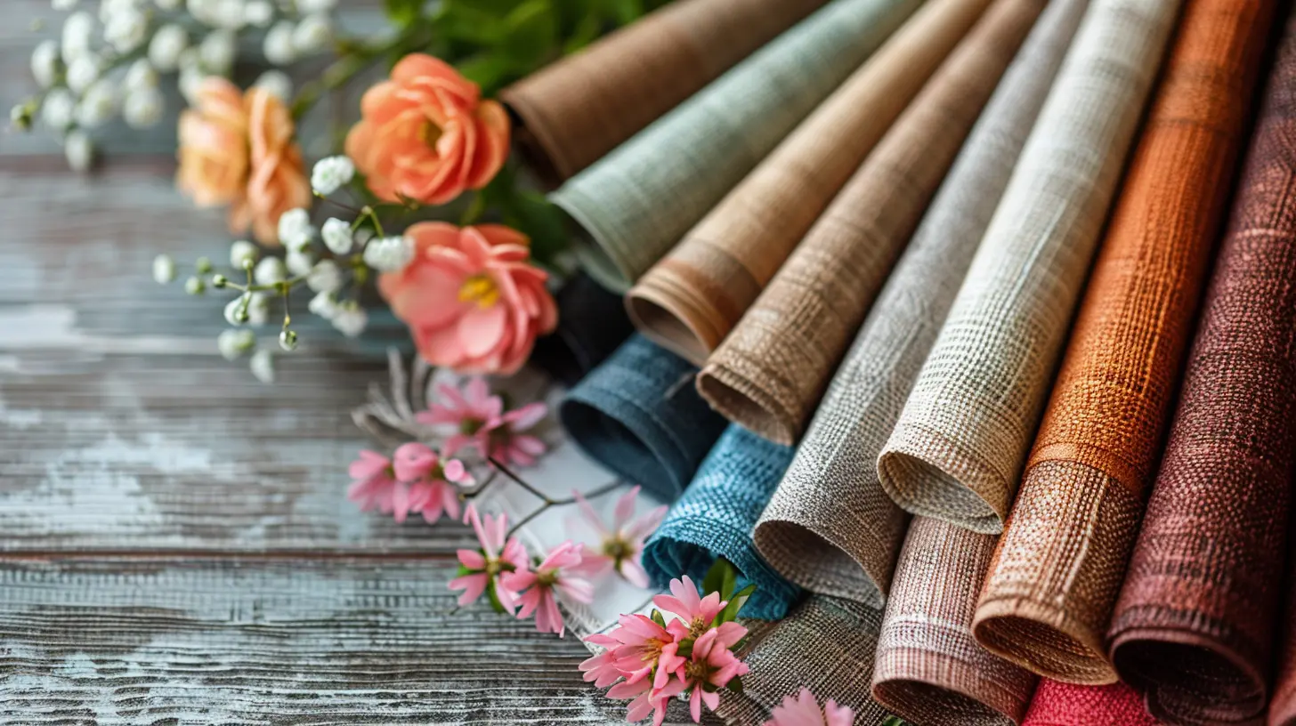
Best Neutral Colors for Home Staging
Now that we know why neutrals work, let’s talk about which shades work best. Contrary to popular belief, “neutral” doesn’t only mean beige—there’s a whole spectrum of colors that fit the bill.1. Warm Neutrals
If you want to create an inviting atmosphere, warm neutrals are your best friend. These shades provide coziness and depth without being overwhelming. Think:- Soft beige – A timeless classic that pairs well with almost anything.
- Warm taupe – A perfect middle ground between gray and brown.
- Creamy whites – Adds warmth without feeling too sterile.
2. Cool Neutrals
Cooler tones work well in modern settings, where a crisp, clean look is desired. These shades tend to feel sleek and sophisticated:- Light gray – A go-to modern neutral that plays well with almost any decor.
- Soft greige – A hybrid of gray and beige (hence the name "greige"), offering the best of both worlds.
- Icy whites – Perfect for a minimalist, airy feel.
3. Earthy Neutrals
If you want to bring a sense of nature indoors, earthy neutrals do the trick. These hues create a relaxed and grounding atmosphere:- Sandy beige – Reminiscent of a peaceful beach.
- Muted olive – A subtle nod to nature without being overpowering.
- Soft clay tones – Adds warmth and character sparingly. 
How to Use Neutrals Effectively in Home Staging
Now that we've picked out some stunning neutral shades, how do we use them without making everything feel too bland? Here are some expert tips to bring neutral colors to life:1. Layering is Key
A room painted all in beige with beige furniture and beige curtains? Yikes! To keep things visually interesting, use layers of different neutral shades. For example, pair a light gray wall with white trim, a taupe sofa, and a soft beige area rug to add depth without color overload.2. Introduce Textures
Textures can make a neutral palette feel dynamic and inviting. Try adding elements like:- Linen curtains for a soft, airy feel
- Woven rugs to add warmth underfoot
- Velvet throw pillows for a touch of luxury
- Wood accents for a natural, organic touch
3. Use Contrasting Tones
Neutral doesn’t mean colorless! A crisp white trim against a greige wall creates contrast, adding depth and dimension to a space. Small tweaks like dark bronze light fixtures or black cabinet hardware can also create contrast without disrupting the neutral flow.4. Bring in Natural Elements
Nature-inspired decor elements can enhance neutral spaces beautifully. Think wooden furniture, stone countertops, jute rugs, and houseplants to add warmth and a fresh, organic feel.5. Add Subtle Pops of Color
While the goal is to keep things neutral, a little color can go a long way. Adding soft blues, warm terracottas, or muted greens through decor pieces like throw pillows, artwork, or ceramics can help the room feel more inviting while still maintaining that neutral charm.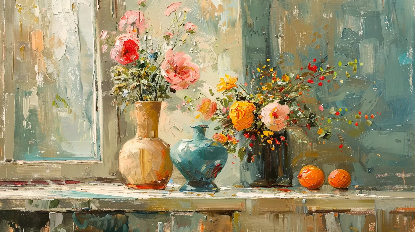
Common Neutral Staging Mistakes (And How to Avoid Them)
Even though neutral colors are a powerhouse in home staging, there are some common mistakes that can make a home feel lifeless instead of inviting. Here’s how to avoid them:1. Going Too Bland
A space filled with all the same beige tones can look dull and outdated. Avoid this by mixing warm and cool neutrals, adding texture, and including contrast where needed.2. Neglecting Lighting
Lighting plays a huge role in how neutral tones appear. Too much artificial light can wash out soft neutrals, while not enough light can make a space feel dull. Natural light is always best, but complement it with warm-toned lighting for a cozy ambiance.3. Ignoring Undertones
Not all neutrals are created equal! Some grays have blue undertones, while others lean toward purple or green. Be sure to test paint samples in different lighting conditions to make sure they work well in your space.4. Using the Wrong White
Sounds crazy, but not all whites work the same way. Some are cool and crisp, while others are warm and inviting. Using the wrong white shade can make a home feel cold or overly stark. The key is to choose the right undertone for the vibe you're going for.Final Thoughts
Neutral color palettes aren’t just a safe choice in home staging—they're a strategic choice. They help potential buyers see the home as a blank slate, making it easier for them to visualize their future in the space. When used effectively, neutral tones create a welcoming, elegant, and universally appealing environment that can help sell homes faster and for a higher price.So, whether you're a homeowner looking to sell or a real estate agent prepping a listing, remember: neutral never means boring—it means smart.
all images in this post were generated using AI tools
Category:
Home StagingAuthor:

Lydia Hodge
Discussion
rate this article
1 comments
Freya Wells
Neutral color palettes in home staging create a versatile backdrop that appeals to a broad audience, allowing potential buyers to envision their personal style. This strategic choice not only enhances the property's aesthetic but also fosters emotional connections, ultimately driving sales.
November 7, 2025 at 5:42 AM
Lydia Hodge
Thank you for your insightful comment! I completely agree that neutral color palettes play a crucial role in home staging by creating a welcoming environment that invites personal interpretation and emotional connections.